My day job is running Prystine Web Solutions, a WordPress web agency, and on the side I build a web tools. One such tool is called Quotify, a price estimator and quote form builder.
Building your own product is a strange kind of mirror, you find out very quickly which of your opinions about good web design actually hold up, because now you’re the one losing users when you get it wrong.
Two features I shipped recently taught me more about forms than years of building them for clients did. Both fixed the same underlying problem: the quiet, undramatic ways a form loses someone before they’ve finished.
Nobody wants to start from a blank page
Here’s a thing I watched happen over and over…
Someone signs up, lands on a “create new” screen, sees an empty form with one lonely question on it, and… closes the tab. Not because the tool was hard. Because a blank anything is intimidating. Blank doc, blank canvas, blank form. The cursor just sits there blinking at you like it’s judging your life choices.
So I added a template library. Six ready-made estimators for the kinds of businesses that charge variable prices: web design, cleaning, photography, renovations, catering, removals. Pick one, change the bits that don’t fit, publish.
The lesson that stuck with me: nobody abandons a tool because it lacked a feature they hadn’t found yet. They abandon it because starting was a faff. Editing something concrete is a job your brain can do at 9am on a Monday. Conjuring something from nothing is not. That applies to a lot more than quote forms, it’s true of basically every “create” screen on the web, and most of them get it wrong.
Read the full feature release write up on Quotify.
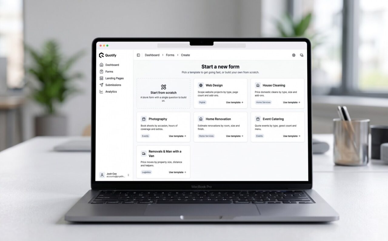
Quotify’s template library page
A good form knows when to shut up
The second one’s about respect, really.
The fastest way to lose someone halfway through a form is to ask them something that obviously doesn’t apply to them.
You’ve felt it, you’re three questions into getting a quote and up pops “how many storeys is your loft conversion?” when you’ve just told it you live in a flat. Small thing. But it’s the exact moment your brain goes “this wasn’t built for me,” and you’re gone.
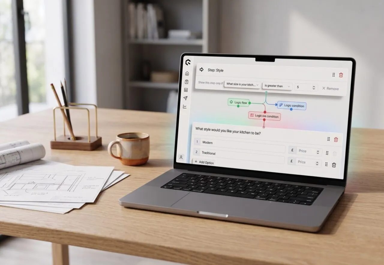
Most forms do this because building one that adapts is more effort than asking everyone everything. So I added conditional logic. Questions and whole steps that only appear when an earlier answer makes them relevant. Quoting a kitchen? Ask the size first, and only show the fancy island-and-pantry questions if it’s a big one. Everyone else never sees them.
The win is double, which is rare: the form gets shorter (every question you don’t ask is one less reason to give up) and the quote gets sharper (you can ask the detailed stuff without burying everyone under questions meant for someone else). Big job, dig deeper. Small job, don’t bother.
But the bit I actually care about is how it feels. When a form reacts to your answers, it stops feeling like a form and starts feeling like someone’s paying attention. It wasn’t built for your specific job; it was built once and it’s branching on the fly, but the person filling it in doesn’t know that, and doesn’t need to.
Read the full feature release notes.
Why I’m telling you this on an agency blog
Because this is the stuff I think about when I build anything for a client, too. Forms, checkouts, onboarding, contact pages: the same two failures show up everywhere. People bounce off the blank start, and they bounce off being asked things that don’t apply to them. Fix those two and you’ve fixed most of what quietly kills conversions.
Building my own product just made it impossible to ignore, because I had to watch it happen to me.
If you want to see either feature in the wild, they’re both live in Quotify. But mostly I wanted to share the lesson, because it’s cost me far less to learn it on my own tool than it would on yours.

Josh Cox
I'm Josh — I build, host and look after WordPress sites (and increasingly fast Astro / Next.js builds) for Oxfordshire businesses, from Didcot, since 2016. I also tinker with a few products of my own on the side.