Nothing was broken. I want to get that out of the way first, because “we’ve redesigned the customer portal” usually means one of two things: something fell over, or someone in marketing got bored.
Neither, this time. My customer portal did its job perfectly well. You could buy hosting, register domains, pay invoices and get into your control panel. It just looked like it had been put together from whatever was lying around in the shed. For someone who builds websites for a living, that’s not a great look.
So I gave it a proper tidy up. Same portal, same logins, same prices, same everything under the bonnet. It just looks like it belongs to me now.
A cleaner, calmer portal
The biggest change is that it now feels like part of prystine.co.uk rather than a distant cousin. Same teal, same type, same rounded buttons.

The WordPress Hosting page, with both plans side by side.
The things I’m happiest with are the small ones:
- The plan cards are easier to compare. What’s included is ticked, what isn’t is crossed out and sits at the bottom, and the price is the biggest thing on the card.
- The descriptions are written in plain English. Every product now says what it’s for and who it suits, rather than listing specs at you.
- The menu makes more sense. Things are grouped under “Hosting & domains” and “Manage”, and “Managed Cloud Hosting” is now just “Cloud Servers”, because that’s what it is.
- The buttons say what they do. The mystery door icon is now a button that says “Sign in”. Revolutionary, I know.
- The clutter’s gone. Duplicate menu links and boxes that repeated what was already on the page have been tidied away.
Dark mode, because it’s 2026
There’s now a light and dark mode toggle in the top corner. Click the little sun and the whole portal switches over, logo and all.

Same page, lights off.
I’ll be honest: nobody asked for this. But if you’re a dark mode person, you’ll know the special pain of a bright white billing page at 11pm. Not any more.
It works properly on your phone
Plenty of people check an invoice or renew a domain on their phone, usually while doing something else. The header used to wrap onto two lines on smaller screens and generally fall over itself. Now it stays on one line, the logo shrinks to fit, and the cards stack neatly.

Light and dark mode on a phone.
The emails got the same treatment
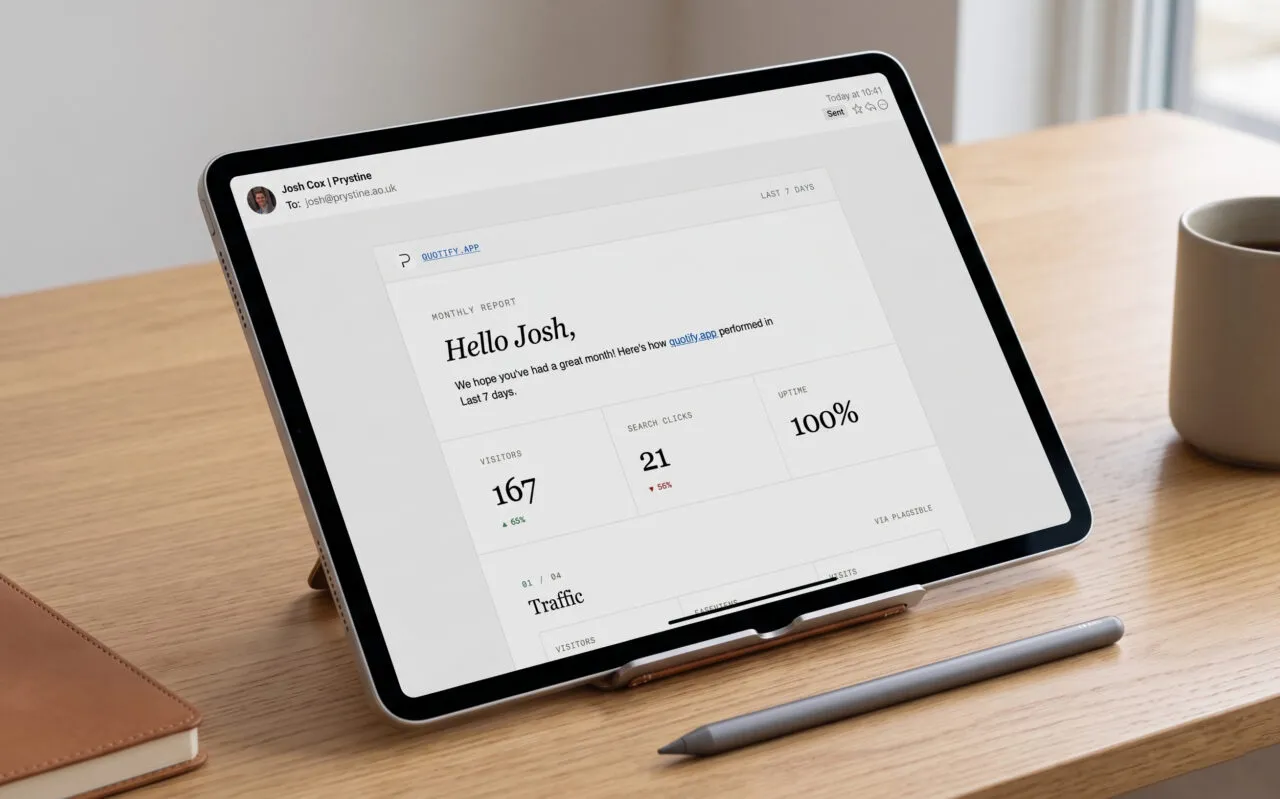
This is the bit I’m most pleased with, because it’s the bit you actually see. The portal sends emails for all sorts of things: renewal reminders, invoices, payment receipts, support tickets, password resets, new hosting details. That’s 42 emails that land in customers’ inboxes, and every single one has been rewritten.
Here’s the same renewal reminder, before and after.

Before: the standard renewal reminder.

After: the same email, rewritten.
The old one wasn’t wrong, exactly. It just read like it was written by a fax machine. “We’re getting in touch to advise that your services are up for renewal in 30 DAYS” is technically English, but only just.
The new ones all follow the same few rules:
- They say what’s happening in the first line. No preamble.
- There’s one obvious thing to click, and it takes you straight to the right page, not the homepage.
- They greet you by your first name where I have it, not your full name like a letter from the council.
- Help is always one reply away. Every email ends with how to get hold of me and a link to the service status page.
- They’re signed by me, because it’s me who’ll be answering if you reply.
They’re also built the old-fashioned way email still needs, with tables and inline styles, so fussy email apps have less to break (yes, Outlook, I’m looking at you). And they shrink down to fit a phone screen.
What hasn’t changed
Everything that matters. Your account, your services, your billing dates and the way you sign in are exactly as they were. This was purely a facelift, so there’s nothing you need to do.
If you’re already a customer, have a click around next time you’re in and let me know what you think. And if you spot anything that looks off, reply to any of those shiny new emails. I’ll see it.

Josh Cox
I'm Josh — I build, host and look after WordPress sites (and increasingly fast Astro / Next.js builds) for Oxfordshire businesses, from Didcot, since 2016. I also tinker with a few products of my own on the side.